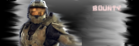
It's not a fail sig. You can't be saying you fail since this is your first time with sig making.
Bg is good with this render. Text shouldn't be put in random places. It has to fit, and as dimon said, try to make the word smaller. You're trying to get us to focus on the render blending in with the sig.
You don't fail.

^That was my first sig I ever made. Compare it? Which one is a fail?
You did a good job, but it needs more work. Don't just put a bg and paste the render and be done with it. Gotta focus on trying add some effects with it too.
Just play around with gimp or PS, what ever you're using. Get to know the tools on there.
Try looking at tutorials. It helps alot.