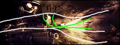
Cesar, this is just to get your mind thinking about where to place your render, text and how to create a nice flow.
Flow = White
Focus point = Green

As you can see, the background is drawn out of the end of the gun forcing people's view closer to that area.
This is called Flow.
The green lines you can see indicate your focus point, any extra lighting will be close to the main flow and towards the text.
As I pretty well mentioned, this is just a guide. Any signature you decide to make when following this needs to be your own idea's and creativity, but make sure you incorporate this in your design.
Hope I helped, after Christmas I will help you with;
1. Depth & Contrast.
2. Visual Realisation. (You will understand when we get to it.
3. Enhanced patterns via C4D.
More to be included further on.