November 24, 2024, 03:08:29 AMLatest Member: Inutwo
BoutCheetah » Forum » Other » Off Topic » Question about GFX?

Question about GFX?

Started by paranoia, October 21, 2013, 09:22:52 PM

Previous topic - Next topic

paranoia

I been scrolling through the GFX section and I noticed some of the images look pretty similar they all have these lines or streaks flowing through them. Then like the tiniest detail messes the picture makes it a bad one like for instance "lighting"  I really wanna know what makes a sig good lol. :D I really dont have no clue.
EGK!

Vobck

October 21, 2013, 09:30:28 PM #1 Last Edit: October 21, 2013, 09:34:59 PM by Vobck
Well, for a sig to be good it has to be appealing to your eye, of course there's some aspects you should consider like:
-Flow: The signature having "flow" itself, lets say a "direction"
Example:
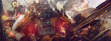
You can see the "effects" I added go in a direction that the render follows.
-Blending: This means the colors have to mix with the render, so they dont look out of place.
Example:
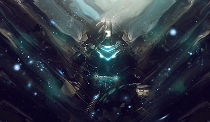
-Lightning: So the render has a natural lightsource, it shouldn't look so forced.

There's some more aspects, but that are the ones I mainly follow :P And you should avoid a stretched render.

paranoia

Quote from: Vobck on October 21, 2013, 09:30:28 PM
Well, for a sig to be good it has to be appealing to your eye, of course there's some aspects you should consider like:
-Flow: The signature having "flow" itself, lets say a "direction"
Example:
You can see the "effects" I added go in a direction that the render follows.
-Blending: This means the colors have to mix with the render, so they dont look out of place.
Example:
-Lightning: So the render has a natural lightsource, it shouldn't look so forced.

There's some more aspects, but that are the ones I mainly follow :P And you should avoid a stretched render.
Oh okay because I was very confused they look the same sometimes :P
EGK!

Copyright © ZylonGaming 2009 - 2024
-Terms of Use-